The Pepsi Logo: A History of an Iconic Brand Mark
One of the most iconic marks ever created, the Pepsi logo has been on a fascinating and tumultuous journey spanning more than a century. The evolution of the Pepsi-Cola brand identity is a masterclass in marketing and design. It reflects changing consumer tastes and the brand's constant drive to stay relevant.
From its intricate script beginnings to the minimalist globe of today, each iteration tells a story. This deep dive explores the complete history of the Pepsi logo.
Early Beginnings: The Birth of Pepsi-Cola
Caleb Bradham, a pharmacist, created "Brad's Drink" in 1893. He renamed it Pepsi-Cola in 1898. The original logo was a custom, elaborate script.
This script was formal and reflected the typographic styles of the era. It established the brand's name with a sense of sophistication and quality.
The 20th Century Evolution: Refining the Brand
The mid-20th century saw Pepsi solidify its position as a major player. The logo underwent significant changes to match its growing ambition.
The Bottle Cap and Redesigns
In 1950, Pepsi introduced a logo featuring a bottle cap. This design incorporated the script within a more structured emblem. It was a move towards a more graphic, memorable symbol.
Further refinements simplified the design throughout the 1960s. The script became cleaner, and the cap emblem was streamlined.
The Introduction of the Pepsi Globe
A monumental shift occurred in 1973. Pepsi unveiled a new logo: the Pepsi globe. This circular design featured a swirling red, white, and blue wave.
It was a bold departure from the script-based logos. The globe symbolized the brand's international aspirations and modern outlook.
- 1991: The globe received a 3D effect and a more dynamic wave.
- 1998: A centennial celebration logo was introduced, adding a slight gradient.
- 2003: The design was flattened again, with a more vibrant color palette.
The 21st Century: Minimalism and a Smile
The new millennium pushed brands towards simplicity and digital friendliness. Pepsi's logo was no exception.
The 2008 Redesign: A Controversial Change
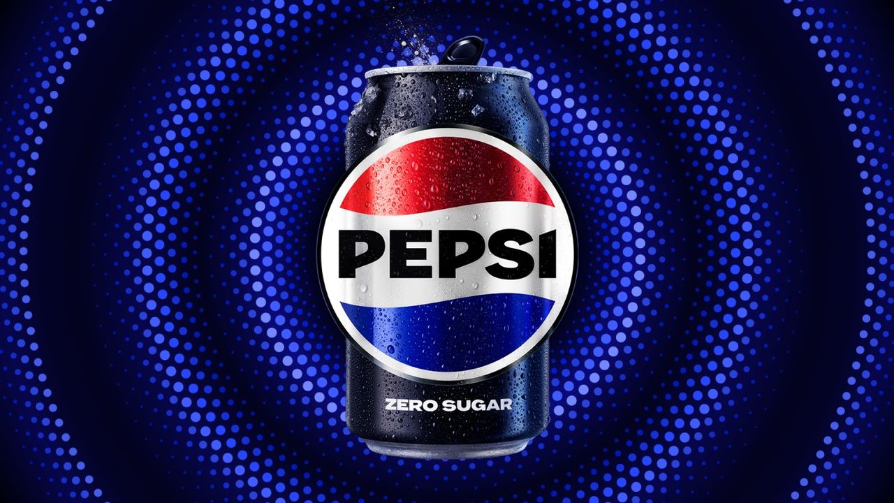
In 2008, Pepsi launched a radically simplified logo. The familiar wave was now a smile, set inside a circle. The brand name was moved to a simple, lowercase font beside the icon.
This change was met with mixed reactions. Some praised its modern, minimalist aesthetic. Others felt it lost the brand's historical connection.
Like a great game receiving a major graphical overhaul, such as the hand-painted Japan-inspired world made with Unreal Engine 5, the redesign was a bold new vision. It prioritized simplicity and scalability across digital platforms.
Recent Updates and Current Logo
The core design from 2008 has remained, with minor tweaks for digital clarity. The current logo is a masterwork of minimalist branding. It is instantly recognizable worldwide.
Its simplicity allows for incredible versatility in marketing. From cans to billboards to app icons, the logo performs perfectly.
The Significance of the Pepsi Logo Evolution
The history of the Pepsi logo is more than just a series of design changes. It mirrors the evolution of graphic design itself.
Reflecting Cultural Shifts
Each redesign captured the spirit of its time. The ornate script spoke to early 20th-century formality. The bold globe reflected post-war optimism and global expansion.
Today's minimalist logo aligns with our fast-paced, digital-first world. It shows how brands must adapt to remain in the cultural conversation, much like how the end of the 'console war' reflects a shift in how we think about gaming platforms.
A Symbol of Brand Rivalry
The Pepsi logo's journey is intrinsically linked to its rivalry with Coca-Cola. Each redesign was a strategic move to differentiate itself. The bold, modern globe was a direct challenge to Coke's classic script.
This competition has driven innovation in both branding and marketing for decades. It's a fascinating case study in how visual identity fuels market competition.
Conclusion: The Enduring Power of an Icon
The Pepsi logo's century-long journey demonstrates the power of adaptive branding. It has successfully navigated changing aesthetics while maintaining core recognition. This iconic mark is a testament to thoughtful, strategic design evolution.
What's your favorite iteration of the Pepsi logo? For more deep dives into iconic design and pop culture, explore our other articles, like our vibrant review of Monster Hunter Stories 3. Discover more insightful content seamlessly on our blog.