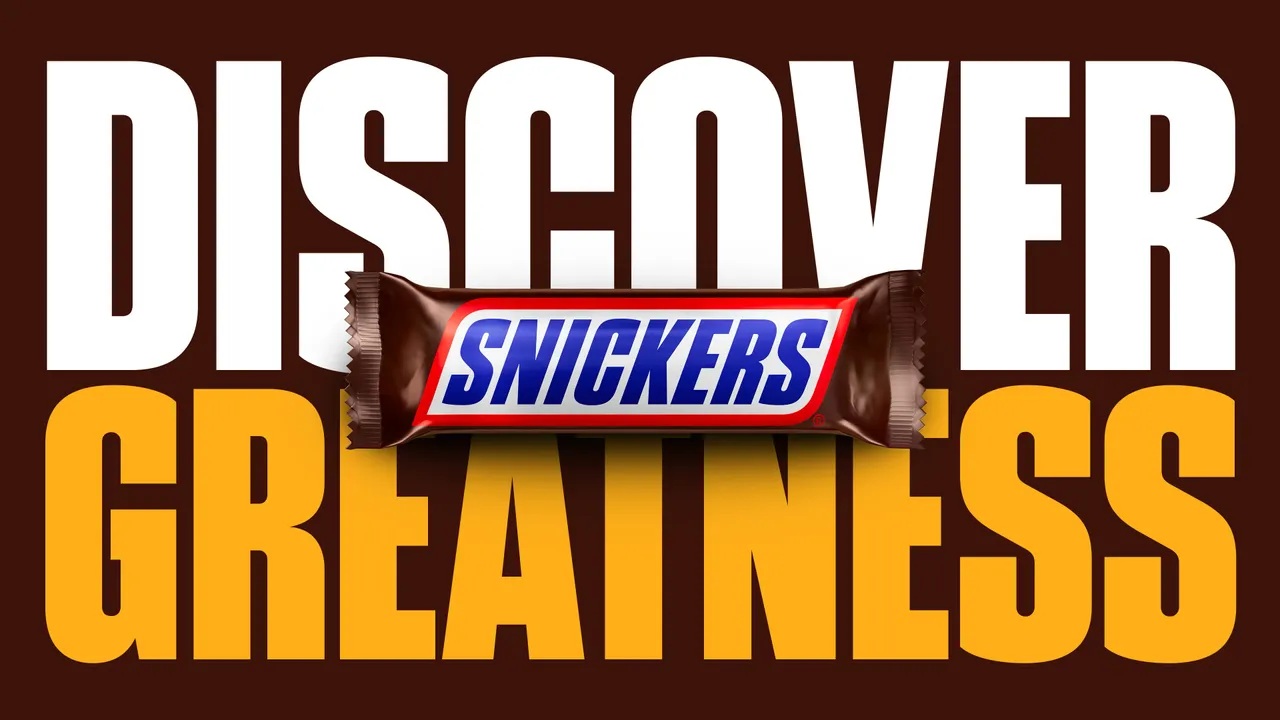
Snickers New Custom Font is Deliciously Nutty
In a move that blends branding with pure creativity, Snickers has unveiled a delectable new custom typeface. This deliciously nutty font, crafted by Studio Drama, gives the iconic candy bar brand a major visual revamp. It's more than just a design update; it's a strategic infusion of personality into every letter. This typographic treat aims to capture the brand's playful and satisfying essence in a truly unique way.
The Recipe Behind Snickers' New Typographic Identity
Creating a custom font for a brand as globally recognized as Snickers is no small feat. Studio Drama, the creative agency behind the project, faced the challenge of translating taste into type. The goal was to develop a visual language that felt inherently "Snickers" – satisfying, substantial, and with a touch of fun.
The design process involved deep dives into the brand's history, its core messaging about satiating hunger, and its distinctive color palette. The resulting font is a masterclass in branded communication, where every curve and serif is intentional.
Key Ingredients in the Font's Design
The "deliciously nutty" aesthetic wasn't achieved by accident. Studio Drama baked specific brand attributes directly into the typography.
- Substance and Weight: Letterforms are rounded and substantial, mirroring the heft and satisfaction of the candy bar itself.
- Playful Curves: Gentle, irregular curves in characters suggest the uneven, chunky texture of peanuts and caramel.
- Color Integration: The font is designed to work seamlessly with Snickers' iconic blue, brown, and red packaging, creating a cohesive visual system.
- Versatility: Despite its distinctive character, the typeface maintains readability across digital and physical applications, from social media ads to in-store signage.
Why Custom Fonts Are a Branding Powerhouse
In a crowded marketplace, differentiation is key. A custom font acts as an exclusive auditory signature for a brand's visual voice. For Snickers, this move goes beyond aesthetics; it's a strategic investment in brand equity and instant recognition.
Off-the-shelf fonts can be used by anyone, but a bespoke typeface is owned intellectual property. It becomes an inseparable part of the brand's identity, much like its logo or slogan. This level of customization prevents brand dilution and ensures a consistent, ownable experience everywhere customers encounter Snickers.
Beyond Candy: Fonts in Entertainment and Tech
The power of bespoke typography isn't confined to food brands. In entertainment, unique fonts are crucial for building worlds and setting tone. For instance, the meticulous concept art for stunning Unreal Engine 5 horror game Ritual Tides undoubtedly extends to a chilling, custom typographic style to heighten immersion.
Similarly, in the tech world, companies use design to communicate innovation. A deep dive into a company like Ramp, where AI agents run everything, would likely reveal a sleek, custom typeface designed to convey efficiency and cutting-edge intelligence. Even movie marketing relies on subtle typographic details, as seen when fans dissect a poster and find a creepy detail hidden in the lettering.
Implementing a Deliciously Nutty Brand Strategy
For Snickers, the launch of this custom font is just the beginning. The true test lies in its application. A successful rollout requires a meticulous plan to ensure the new typographic identity strengthens the brand across all touchpoints.
We can expect to see the deliciously nutty font appearing consistently in key areas:
- Digital Advertising: Social media campaigns and online banners will get a unified, appetizing look.
- Packaging Evolution: While maintaining iconic elements, packaging may see subtle refreshes that incorporate the new typeface.
- In-Store Marketing: Point-of-sale displays and promotions will gain a distinctive, ownable style.
- Brand Partnerships: Any co-marketing efforts will carry a consistent and recognizable typographic signature.
The Lasting Impact of a Tasty Typeface
Snickers' new custom font is a bold and clever step in modern brand building. By investing in a deliciously nutty typographic identity, the brand moves from simply using fonts to owning a key piece of its sensory landscape. It proves that effective branding engages more than just taste buds; it engages the eyes and mind, creating a memorable and holistic experience.
This strategic design choice by Studio Drama ensures that Snickers isn't just seen—it's recognized, remembered, and craved. In the end, the font does more than spell words; it reinforces the promise of satisfaction in every communication.
Conclusion
From its substantial curves to its playful spirit, Snickers' new custom typeface is a masterful blend of design and branding. It shows how a deliberate creative choice can become a powerful brand asset. Hungry for more insightful analysis on design, branding, and pop culture? Explore more thought-provoking articles right here on Seemless.