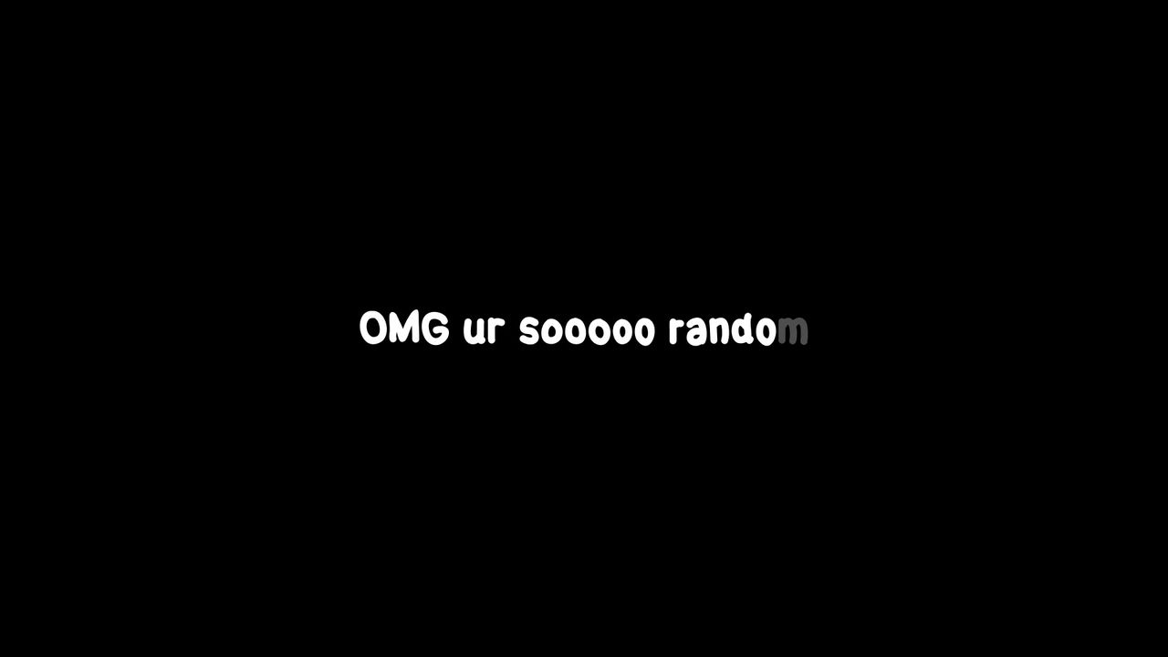
Rando Sans: The Handwriting Font That Fixes Everything
In the world of typography, a new contender has arrived with a bold promise. Rando Sans is being hailed as 'Comic Sans on steroids,' and it aims to solve the biggest problem with handwriting fonts: inconsistency. For designers and brands seeking authentic, quirky typography that remains legible and functional, this font could be a game-changer.
Handwriting fonts often struggle with uniformity, making them difficult to use in professional settings. Rando Sans tackles this head-on by blending chaotic charm with structural reliability. This article explores why this wild new typeface is capturing attention and how it addresses long-standing font frustrations.
The Biggest Problem with Handwriting Fonts
Traditional handwriting fonts are beloved for their personality. They evoke a sense of authenticity and human touch that rigid, geometric typefaces lack. However, this very strength is also their greatest weakness.
The primary issue is a lack of consistency. Characters can appear disjointed, leading to poor readability in longer texts. This inconsistency makes them unsuitable for body copy or important communications.
Why Consistency Matters in Typography
Consistency is the backbone of effective typography. It ensures that text is easy to read and visually cohesive. When letters flow smoothly, readers can focus on the message without distraction.
Handwriting fonts often fail here. Their random variations, while charming in small doses, create visual noise. This can undermine professionalism and clarity, especially in branding or web design.
- Readability Suffers: Inconsistent letterforms force the eye to work harder.
- Branding Challenges: A lack of uniformity can dilute brand identity.
- Limited Application: They are often restricted to headlines or decorative elements.
How Rando Sans Solves These Issues
Rando Sans enters the scene with a clever approach. It retains the playful, hand-drawn aesthetic that makes handwriting fonts appealing. Yet, it introduces a underlying structure that ensures coherence across all characters.
This balance is what earns it the 'Comic Sans on steroids' moniker. It has the fun, approachable vibe of Comic Sans but with enhanced versatility and control. Designers no longer have to choose between personality and professionalism.
Key Features of Rando Sans
The font incorporates several innovative features that set it apart. These elements work together to create a unique typographic experience.
- Controlled Variation: Each character has multiple alternates, but they are designed to harmonize.
- Optimized Spacing: Kerning and tracking are finely tuned for optimal legibility.
- Extended Character Set: Supports multiple languages and special characters for global use.
These features make Rando Sans suitable for a wide range of applications. From website headers to product packaging, it delivers consistency without sacrificing character.
Rando Sans in the Wild: Real-World Applications
Seeing is believing, and Rando Sans is already making waves in various design projects. Its ability to convey friendliness while maintaining clarity makes it a popular choice for startups and creative agencies.
For instance, it has been used in branding campaigns where a human touch is crucial. The font helps companies stand out while ensuring their message is clear and accessible.
Case Study: A Successful Rebrand
Consider a recent rebrand by an indie company. They switched from a generic sans-serif to Rando Sans for their logo and marketing materials. The result was a immediate boost in brand recognition and engagement.
This success story highlights the font's practical benefits. It proves that with the right tool, handwriting typography can be both expressive and effective. It’s a reminder that sometimes, the most significant changes come from challenging conventions.
The Future of Expressive Typography
Rando Sans is part of a larger trend towards more dynamic and personality-driven typefaces. As digital spaces become more crowded, brands are seeking ways to connect on a human level. Typography is a powerful tool in this effort.
This movement isn't just about aesthetics; it's about communication. Fonts like Rando Sans enable more nuanced and engaging dialogues with audiences. They break down the barriers between corporate messaging and genuine interaction.
This evolution mirrors other creative breakthroughs, such as the unexpected success stories we see in entertainment. For example, the recognition of unique projects like KPop Demon Hunters at the Oscars shows a growing appetite for innovation. Similarly, the rise of unconventional fonts signals a shift in design priorities.
Conclusion: Embrace the Chaos, Keep the Clarity
Rando Sans represents a significant step forward for handwriting fonts. By solving the consistency problem, it opens up new possibilities for designers and brands. It proves that you don't have to sacrifice readability for personality.
If you're looking to inject some life into your projects, consider giving Rando Sans a try. Explore its features and see how it can transform your designs. For more insights and tools to enhance your creative workflow, visit Seemless today.