Firefox Teases New Logo WITHOUT Iconic Fox
The internet is buzzing after Mozilla dropped a major teaser: a potential new Firefox logo that conspicuously lacks its most famous feature—the iconic fox. This bold move signals a significant evolution for one of the web's most recognizable brands. For years, the swift fox wrapped around a blue globe has been synonymous with a fast, independent browsing experience. Its potential departure marks a pivotal moment, prompting questions about brand identity, modern design, and what this means for the browser's future direction and user perception in a competitive digital landscape.
Decoding the Teaser: What We're Seeing
The teaser material is intriguingly minimalist. Mozilla has shared abstract, geometric shapes and fluid lines that suggest motion and connectivity. The color palette seems to retain familiar fiery oranges and deep blues, creating a visual bridge to the past.
However, the literal representation of the fox is entirely absent. This shift from a detailed animal illustration to a more abstract symbol is a massive design leap. It moves the brand from a specific narrative to a conceptual identity focused on speed, innovation, and the open web.
A Departure from Literal Branding
For decades, the fox was more than a mascot; it was the story. It represented cleverness, agility, and a fiery spirit. This new direction suggests Mozilla believes the core values can be communicated without the literal animal. The design appears to focus on the "fire" and the "fox" as concepts—energy, intelligence, and swift movement—rather than a direct depiction.
This aligns with a broader tech trend where logos simplify to be more versatile across countless digital platforms, from favicons to app icons. A complex fox doesn't always scale down well, but an abstract flame or dynamic shape can.
Why Rebrand? The Strategy Behind the Change
A logo change of this magnitude is never just about aesthetics. It's a strategic statement. For Mozilla, this likely serves several key purposes aimed at refreshing the brand for a new era.
- Modernization: The current logo, while beloved, is a product of its time. A sleeker, abstract design positions Firefox as a contemporary and forward-looking player against competitors like Chrome and Edge.
- Platform Versatility: Today's brands exist everywhere—from smartwatch screens to VR environments. A simpler, more geometric logo is adaptable and legible at any size, which is crucial for digital-first presence.
- Refocusing the Narrative: This shift could signal a desire to emphasize Firefox's core mission—privacy, an open internet, and user agency—over the animal mascot. The brand becomes about what it *does* for you, not just what it *is*.
User Reaction: Nostalgia vs. Progress
Initial reactions online are mixed, as expected with any iconic change. Long-time users express a heartfelt attachment to the familiar fox, viewing it as a trusted friend in the browser wars. This emotional connection is powerful and not easily replaced.
Conversely, many design and tech commentators applaud the courage to evolve. They argue that for Firefox to attract new generations of users, it needs a visual identity that feels fresh, fast, and aligned with modern UI principles. The challenge is balancing heritage with innovation.
Historical Context: Firefox's Logo Evolution
This isn't Firefox's first logo change. The browser's visual history shows a clear journey toward simplification, making this potential new direction a logical, if dramatic, next step.
- 2004 - Phoenix/Firebird: The very first iterations featured a highly detailed, mythical bird engulfed in flames, a far cry from today's designs.
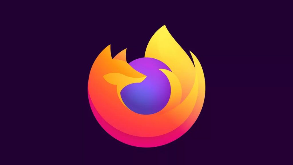
- 2005 - The Classic Fox: The iconic fox wrapping a globe was introduced, establishing the beloved character that defined the brand for over 15 years.
- 2019 - The System Update: The logo was flattened and simplified, losing some 3D effects but keeping the fox intact. This was a precursor to a more abstract future.
- 2024(?) - The Abstract Era: The current teaser points to a complete departure, replacing the literal fox with symbolic geometry representing its core attributes.
This evolution mirrors trends in other industries, where brands like Apple, Nike, and Shell moved from detailed pictures to timeless, scalable symbols. For a deeper look at how nostalgia and modern design intersect, explore our piece on essential retro video game consoles that mastered iconic branding.
What This Means for the Future of Browsing
Beyond branding, a logo change of this scale often precedes or accompanies major product shifts. It can be a visual flag planted for new initiatives. We might anticipate Firefox doubling down on features that differentiate it in the market.
A Signal of Product Ambition
The rebrand could herald a renewed focus on privacy tools, cross-device synchronization, or even ventures into new areas like AI-assisted browsing. A new face often means a renewed internal mission. It declares that Firefox is not just maintaining but aggressively innovating.
Just as a surprising format can redefine a medium—like a children's book that appears blank in the daytime—a radical logo change redefines user expectations and opens the door to new possibilities.
Conclusion: Embracing Change in the Digital Landscape
The teaser for a new Firefox logo without its iconic fox is a bold gamble on the future. It trades immediate recognition for modern versatility and symbolic depth. While the fox will always hold a special place in internet history, its potential retirement signifies Mozilla's commitment to evolution.
Brands must adapt to stay relevant, and this move shows Firefox is willing to take that leap. The final design will need to skillfully carry the legacy of its values into a new visual language. What do you think about the change? Share your thoughts, and for more insightful analysis on evolving trends in tech and culture, be sure to explore our other articles, such as our guide to elegant Bridgerton gifts. Stay curious with Seemless.